Evaluation question 1: In what ways does your media product use, develop and challenge forms and conventions on real media products?

.To answer this question, I will look at the way my product uses forms and conventions of Film Noir, and of film in general. All films follow a narrative. This powerpoint I made explains the most recognised theories on narrative.


To some extent, my film follows all these theories. Obviously there is a beginning, a middle and an end. As my film is only 5 minutes long, it doesn't have enough time to progress through all 5 stages of equilibrium. As the film results in the death of 2 characters, equilibrium is not restored, and therefore is no new equilibrium.
The character types in my film according to propp's theory are:

  • The Detective - The false hero (He's the protagonist, but he's not a hero as he's quite corrupt.)
  • New detective - The helper (Tries to help the detective solve a case, but ends up getting killed.)
  • Crime bosses - Villains (Paying money for the detective to murder someone)
As none of my characters are "good", it means there is no obvious hero. The closest there is to that is the new detective, but he is not prominent enough to earn such a title. Binary oppositions in my film include good and evil and morality and immorality. 


In terms of Film Noir, my film follows the codes and conventions as accurately as I could of made it.

I shot my film in black and white, a basic convention of Film Noir. I based the character types (corrupt detectives and criminals) on archetypes built by the noir genre. I tried to imitate the lighting as best as i could. All indoor shots had a portable lamp positioned behind shot, aiming on the scene that was being filmed. This created lots of shadows, another staple of the genre. Shadows help to build the mysterious atmosphere associated with Noir. The music included was jazz, which is featured heavily in noir. This is to create a smooth, sophisticated and dark feel to the film. I used dutch angles to attempt to create an air of disorientation, another common technique. However, to some people unfamiliar with the genre, they may interpret tilted angles as bad camera work. I included noticeable iconography in the mise-en-scene and the characters costumes, such as suits, cigarettes, trilbys and alcohol. One way in which i challenged the conventions was the choice to set it in a more rural, quieter suburb. This is a contrast to most noir, set in large, neon lit cities.

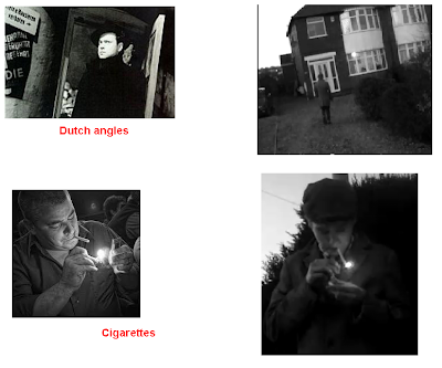
Here is a visual chart of how I stuck to codes and conventions of film noir:


Evaluation question 2: how effective is the combination of your main product and ancillary tasks?


This is the final version of my film; "The Detective". I followed a simple narrative, from the perspective of the protagonist detective. This was to allow the audience to empathise with the character, even if his morals are a bit questionable. This was achieved by the character being present in all scenes throughout. In order to further establish a noir feel, as well as the visuals and story, the sound was important. As the noir i had previously viewed for my research mainly consisted of a smooth jazz soundtrack, i looked online for copyright free jazz that fitted what i was looking for. After much searching, I eventually found a website full of free jazz music: http://incompetech.com/m/c/royalty-free/index.html?genre=Jazz
I listened to them all and decided on two tracks. The first one had an aire of ambiguity to it, which i thought would fit the scene perfectly. For the second track, i wante something downbeat, a bit melancholy, but still sounded very noir. I eventually found that, and included it for the final couple of scenes, concluding in the final hanging scene, where the music fades out to a slow motion shot. I hoped this would instill a sort of reflection within the audience.

For my poster, i wanted something that looked quite artistic, but still inspired any potential viewers to go and watch the film. I chose to use a single frame from the film as the background for the poster. It was a shot of the back of the detectives head, as he was walking towards a house. I hoped this would interest the viewer enough to watch it, but still retain a good amount of myster surrounding the film. This was particularly important for me, as mystery is a key staple in Film Noir. As well as looking good, a poster also has to include institutional information, as this might entice more hardcore film viewers. I included this, aswell as the certificate, so people would be aware of wether they could watch it or not. I made sure that it fit in with rest of my tasks aesthetically. This was done by using only a simple colour scheme, mainly black and white, but also a dash of red. Although my film is black and white, i believe the slight use of red makes it more visually pleasing, and still manages to retain a noir mood. Using photoshop to create my poster, i utilised the use of shadow on the text, making it stand out more. Also, shadows are another convention of film noir.

For my review, i again tried to create an interesting layout, which also serves a piece of noir. I used images form my film to decorate the artice, and so that the reader would be able to recognise it better. An identical colour scheme was used, establishing a definate link between all three of my products. I inclued a small box entitled "key facts", to ensure that even if the reader was just flicking through the magazine, they would still be awarr of the film, and know quite a bit of necessary information. For the write up, i tried to make it as accurate as possible, including important aspects of the film in the review, such as actors, the director, and illusions to other films. Also, it's a lot easier to write critically about yourself than it is to be full of praise. I figured any attempts to write a positive review would be insincere. To ensure my layout was as close to a real product as possible, i closely followed the design from an already existing review:

Evaluation question 3: What have you learnt from audience feedback?

I guess one of  the most important lessons I learnt from audience feedback would be to actually listen to people. As I was working by myself (mainly down to my own arrogance and stubbornness) I never got any opinions on what I was doing as I was doing it. Everything that got done was entirely down to me, and as my "people skills" are generally pathetic, I never consulted anyone for a second opinion, to check if my work was okay, and what could be done if it wasn't. Looking back, it probably wasn't the best move.
Also, another thing I should of done was produce a rough cut and shown it to people. This would allow me to make much needed improvements. Instead, I only showed my film once it was all completed. This meant problems with it couldn't be fixed, but that is also in parts down to my poor time keeping.

Once my film was all done, I messaged some people over Facebook to get their reactions to it. This is what they had to say:


Generally, the response was positive, which surprises me quite a bit. Although I have to wonder if they weren't confronted in the way they were, whether the response would be the same. A message directly from the creator of the film could make it hard for some people to outright criticize it. The features most praised were:

  • Music
  • Camera work
  • Lighting
  • Story
And my personal favourite, "wasn't a romcom"

Negative points raised by the audience feedback mainly concern:

  • Steadiness of camera
  • Problems with acting
  • Audio distortion
  • Small production mistakes (tripod shadow, visible lamp) 

If I was to re-shoot the film, I would take into account all of what people have said. I would take into consideration the shakiness of the camera, utilizing the tripod as much as I could, and doing less shots by holding the camera. Although this would make it harder for shots in which the camera needs to move around freely. I would take more time into finding proper actors for all the parts, instead of the major parts. I didn't take into account how amateur the final product may look just by having my non-acting friends in it for a couple of lines. Also, I would not be in it. I would make sure all shots where someone looks directly into the camera are re-filmed. On set, I would ensure all props and equipment be out of shot, to ensure they, or their shadows, appear on film. In the editing suite, I would equalise the volume levels, and turn the dialogue track down, so distortion doesn't occur.

Evaluation Question 4. How did you use new media technologies in the construction and research, planning and evaluation stages?

.

1) iMovie - This is the software I used to import all footage and edit the film. The whole process was a lot smoother than last year, as i was already used to the program, and all its functions.This allowed me to use effects that made up my film, such as black & white and slow motion for the final shot. However, the same limitations affected me this year as well. These included minimal timelines, only 2 for visuals and one for audio. this meant I had a lot less freedom in my editing technique, having to compress all footage onto 2 timelines. Apart from that, the main problem I have with the software is the titling feature, which frustrated me just as much this year. It is virtually impossible to get the desired results by using this feature. It is incredibly limited in what it can achieve, which is mostly basic text appearing on screen. As a result, I had to title my film in such a way that could be done with the software.


2) Flickr - Flickr is a website where users upload and share images. As a result, it has one of the internets largest image collections. This was useful for me when I needed images for planning and research, as well as in the construction of my moodboard.


3) Facebook - Facebook is the largest social networking site in the world. It allows people to contact each other and for easy sharing of information. I used it to send people a link to my film, and to keep track of their responses. This allowed me to get proper feedback regarding my film.


4) Slideshare - This allows me to upload presentations / documents from my hard drive to the internet, allowing me to demonstrate the full extent of my planning and research. It also made the blog more interesting, as I tried not to make it too text heavy as far as I could help it.


5) MS Paint - Although it is an incredibly basic image editor, it was sufficient enough to deal with what I needed it for, which was the creation of the moodboard, and the image above. For more sophisticated editing, I turned to Photoshop.


6) Photoshop Elements - This was the main software I used for image manipulation. This is down to the fact that it offers a wide range of effects and filters, and is also user friendly. With no experience of the software, it wan't long before I became competent enough to use it for what I needed it for. I used it in the creation of my poster and film review.


7) Blogger - Blogger allows me to display my work neatly and concisely in one place.  I used it last year for my AS coursework, so I knew what I was doing this time.


8) Google - Google is the largest and most well known search engine on the internet. I used it constantly throughout the production, mainly for research details, or to find out about anything that I was looking for.


9) Youtube - Youtube is a video hosting website, where users can upload their own videos and share them across the internet. This allowed me to look at previous A2 work, and examples of genuine Film Noir, to inspire my work, and to ensure I knew what I was doing. Also, after my film was all shot and edited, I uploaded it onto Youtube, to show others for the evaluation, and to upload it to the blog itself.


10) Sony Handycam - The camera I used was a fairly standard portable camcorder, nothing too fancy. This was ideal for my film, as it didn't require any advanced trickery. The only feature I used was the zoom, but i regret that now as I feel it looks unprofessional and unnecessary.


Also worth noting was the use of the Mac itself. As someone more accustomed to the operating systems of Windows, learning to use a mac efficiently is a challenge which I improved at over the course of the year. Not included on the chart above is use of a tripod, which is important for getting a perfectly framed shot, without the shaking. Also, I used Open Office to create presentations, questionnaires and the script, all of which I uploaded to the blog.

Reviews

In order to write a review, and design an appropriate layout, I had to look at existing products, noting their codes and conventions. For the design layout, I took apart what makes a good magazine spread. This helped me when it came to producing my final piece.


When it came to designing my layout, I wanted to incorporate all the above features, but also keep it in within the noir aesthetic scheme. Here is my final review:


Also, having looked at it again after uploading, there is a typo in the "key facts" box, with "produced" being spelt as "prduced" This was of course fully unintentional. 

Posters

As well as producing a short film, as part of the course we are also expected to create a film poster & a magazine review. In order to undergo this, I had to analyse existing products in this format, to understand what makes an effective poster, and why. This is an analysis of a poster advertising "The Dark Knight" I created using Microsoft Paint:


Here is my completed poster:


Filming

Today, I went out and filmed my film. Fortuantly, everything went to plan. I hope so anyway, i have yet to watch the footage back yet to check for unforeseen complications or errors. Everyone turned up on time, in correct costume, ready to film. However, as there are 4 characters, and only 2 of them are played by people associated with drama or acting in their spare time. This means that the scene with myself and Rub might look amateur and poorly acted. To begin with, Rob was supposed to play the main gangster crime boss, but he couldn't remember his few lines, so we swapped roles. This meant I am in the film more than i was expected, and more than I would of liked to be. Having to look at myself and listen to myself will make editing a more horrific task than it needs to be. I filmed the outdoor scenes first to take full advantage of the light, as the days are short, so outdoor filming hours are reduced. Thankfully, Film Noir is renowned for being dark so the slightly dark scenes will not be a problem. For the indoor scenes, lighting was done with a large, but portable, lamp that we carried around from room to room when necessary. The lamp allowed full flexibility of lighting, as I could position it in any way to fit with what effect i was after. This came in particularly useful in the shadow stabbing scene.


                                                                        The "Gangsters"
                                                            
                                                        Obligatory "hard at work" photo
      
                                                            The bridge where the meeting occurs.

                                                                     The detectives!

A murder...

                                                                  Investigating a murder.
                                                          A photo of the filming! Artsy!